Making an effective School Website: Lessons Learned from a successful Catholic School

Why is having a site significant?
Your audience is spending more and more of their time online.
Even if schools typically meet parents offline, all kinds of businesses have started to measure success by their ability to build online relationships. And, your website can play a huge part in that.
Interesting fact: Once on a company’s homepage, 86% of visitors want to see information about that company’s products/services. (Source: KoMarketing)
Think about it:
A website can be seen concurrently by 30,000 people. Your school’s campus have 30,000 visitors in a lifetime.
So, your business may be well established offline, but it’s also crucial to get the basics of online in place.
Let’s take a closer look.
Do you have a website that speaks loudly about your school’s identity?
To whom do you speak? Who are the people you want to communicate with?
What is your website’s objective?
Every tool, from a ballpoint pen to a car, has a niche audience. Do you know what your school’s website audience is?
Almost 90% of your prospective families will use the internet to find schools within their area before they try anything else.
If a person just moved into an area and wanted to find a supermarket, a dentist, a dance school, a daycare, or a high school, what do they do?
They search online.
And it takes only a matter of seconds to make a good impression.
So, what you need is an online presence that stands out so that you capture your potential family’s attention in the fleeting moments that they have.
A site, which convinces people that this school has the answers to the ‘problem’ they’re trying to solve.
As a small business, it’s unlikely you’ll have big budgets, staff or free personnel hours to invest in a complex online strategy, but there are certainly some simple steps you can take to start reaping the rewards that the web can bring.
It can be tough to know where to turn when you are developing your marketing plan. Newspaper ads? Radio? Facebook? As an organization looking to advertise, there are so many avenues to go explore.
But what could you work on to see the most improvement while causing the least confusion?
Let’s backtrack.
How did you find this article? If you answered “Google!” then you may already know what I’m getting at. An overlooked tool for your school recruitment efforts is your website. After all, “50% of consumers who conducted a local search on their smartphone visited a store within a day.” That means local searchers are poised to take action.
Unfortunately, most school websites are outdated and cumbersome. The more outdated a site is, the less likely it is to appear in Google search results.
If that sounds familiar, let’s see what we could learn from a successful private school’s site. Not a huge, expensive New York City private academy, but St. Jude Catholic School in Fort Wayne, Indiana:
First impressions mean everything.
First impressions are called anchors for a reason: human behavior relies on these anchoring events when making a decision.
To make a great first impression on a potential family, as well as increase the chances they will find you on Google, you’ll need a clear landing page. Comparing St. Jude’s website to the sites of other Fort Wayne Catholic schools, we can see a tremendous difference:
St. Jude’s clear layout stands above the rest.
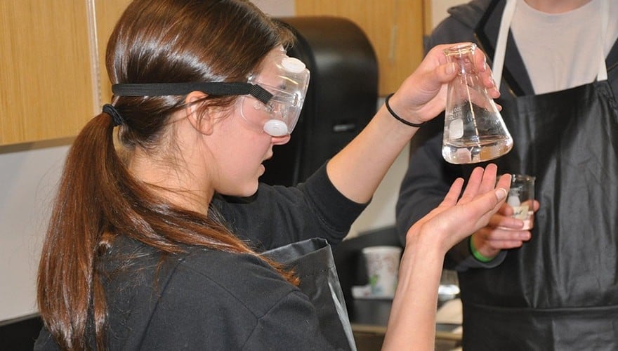
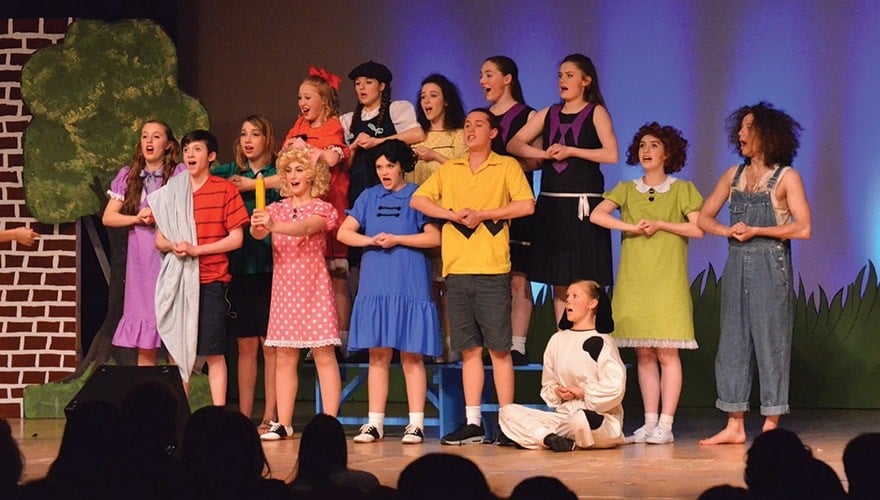
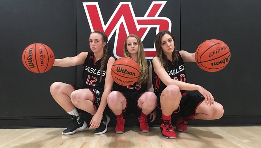
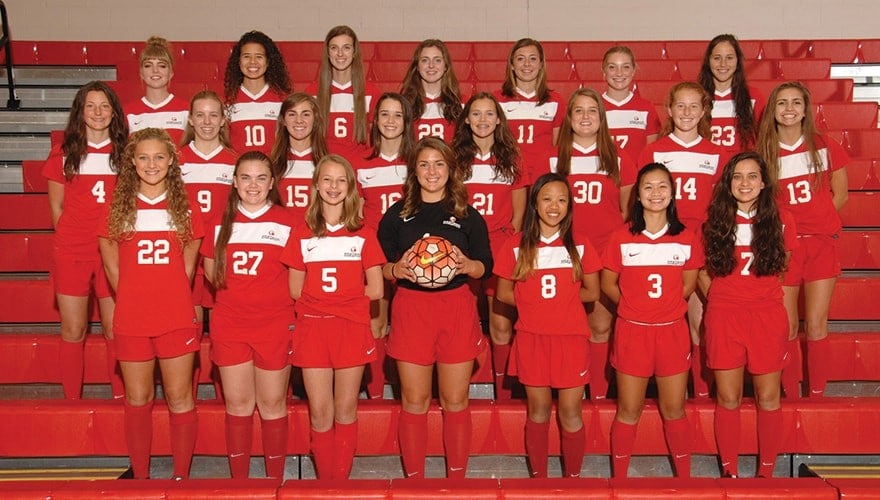
A camera roll showcases happy scenes from the school. Also, the camera roll is big enough to see the pictures clearly but small enough so that you can easily see their informational sections.
Directly below the pictures?
Their “Mission” statement and the “Home” box, which both have a bit of info about the school.
This is what you want to display to visitors when they first land on your page. We can compare this with two rival schools who appeared below St. Jude in search results.
Beware of information overload.
One school puts current events at the top and the school mission way down at the bottom of the page. While this may be beneficial for current parents who don’t read the monthly newsletters, who are they forgetting?
Prospective families.
What’s more?
Putting the mission at the bottom of the landing page can hurt your search result status. Google will see this info as less critical to your page and that would result in a demotion within their search rankings.
Sparse pages – Where to put your trust?
Another school chooses a more straightforward route, sacrificing clear space for clutter.
You may be thinking: “Well, we should not have too many distractions on the front page, like current events, we should have nothing but the mission statement up there!”
That makes sense, but it’s not that simple.
Presenting a mostly empty web page can incite a fear of the unknown – fear that you are hiding something.
Prospective families will see a sparse page and think:
“What is going on here? They seem like they don’t have a clear idea of who they are – will my child succeed at a place like that?”
This is not the thinking that leads to enrollment.
Also, your search engine ranking will suffer. By having too little information, Google will have a similar response to those prospective parents we just imagined. Your page will be seen as less trustworthy than it could be.
A lack of precise information equals decreased search ranking.
And that means less customer conversion.
So, how does a school create a landing page that gives just enough information while emphasizing content for conversion?
Let’s break it down step-by-step.
Seven elements of a landing page that leads to enrollment:
Clear Title – At the top of the page, we have the school name in a medium-size bold font.
A clear title fits the Goldilocks of enrollment marketing: not too big, not too splashy. Just enough to let us know that we reached our destination.
Contact info – Next to the school name we have the contact phone number of the school.
Prospective families can call to schedule a school visit or ask about enrollment on the spot.
That’s what we call ‘immediate action.’
And what’s waiting a little further down the page?
Contact info – again! What’s this? Another copy of the phone number? You bet.
In case a prospective parent has read this far and is interested, the school has put their phone number by the information. Just another reminder to call today.
Photo roll – Like the title, this is a moderate size. It will grab the attention of the visitor but doesn’t obscure the rest of the page.
And it’s an excellent way to showcase your school’s dedication to the community.
Mission statement – The school’s mission takes a front row seat. Prospective families should know precisely what the school is about.
As it’s one of the first things a visitor will see, St. Jude Catholic School is doing it right:
Concise information with an eye-catching visual.
Home box – The image of the front of the school and a brief message about its history rests right in the middle.
As it should since it’s the most important info.
Current events – St Jude knows that many visitors are current parents, and doesn’t ignore their needs. To the right is a list of current events, small enough to not take away from the rest of the page but large enough to be read effortlessly.
Additionally, a current-events list lets visitors know that your page is updated.
And that’s reassuring for parents and visitors alike.
Donate box and prayer request box – St Jude reminds you of the organization’s mission:
To promote love and kindness.
At the bottom of the page, you are given the options of engaging with the school in two ways, which don’t require the commitment of enrollment.
And yet this act of building trust and establishing community helps to accomplish two essential enrollment marketing actions:
Building trust and gradually persuading.
Enrollment marketing is a marathon, not a sprint. St. Jude’s got the right idea.
Conclusion
In conclusion, St. Jude’s page is informative, concise and engaging.
How do they do it?
By arranging a focused variety of information in a clear format on their homepage.
This is a great start to communicating with prospective parents. Of course, that’s not all there is to an exceptional school website.
What’s next?
You won’t believe what you can do with dedicated landing pages.